In real life, the frame matters
September 22nd, 2006It is somewhat rare to show framed pictures on the internet. Perhaps this is because the internet is something of a frame in itself. We are here following Hanneke van Oosterhout’s still-life painting, from the drawing to (hopefully) the gallery-sold work; in real life her work benefits from the real type of frame.
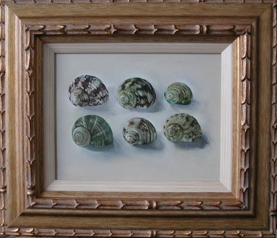
Choosing a good frame is difficult. Compared to painting the painting, choosing the frame is highly constrained by one factor in particular: cost. The ideal frame can raise the market value of a painting, but before an exhibition, one does not know what will sell. Investing in the frame is therefore a sort of speculation. For the painting above, Hanneke felt she made a satisfactory choice. The physical texture of the frame complements that painted in the shells. The frame is made from pre-fabricated profile stock and was not inordinately expensive. In the photo it looks pretty good. But in real life the frame screams, “second rate quality!” The reason for this is simple. The physical texture of the profile stock, prefabricated rather than hand crafted for this frame, does not “mesh” at the corners where the profile was cut and joined together. This subtle aspect is important in real life. It undercuts the value of the frame (and the painting) for the discerning collector. I suppose the really discerning collector would buy the painting and invest in a new frame.
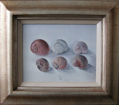
In the work above, the frame is hand-crafted. That is to say, someone did some work decorating the frame after the corners were joined. In the photo, this is not obvious, but in real life, it makes a big difference in the feeling of the frame, its feeling of worth. Of course, this type of frame is somewhat more expensive. But if a painting is good, a certain quality (and expense) of frame is called for, otherwise the frame drags the painting down. A good frame helps, but better no frame than the wrong frame.
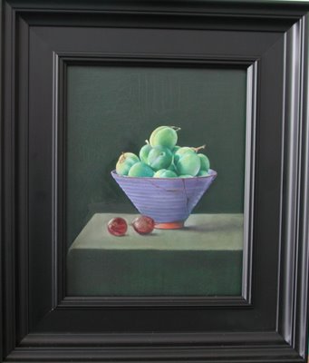
The frame depicted above (sorry about the quality of the photo) is made from pre-fabricated stock, the type of frame you can buy at a normal frame-making shop. Although not “hand finished” it does not have a “cheap” feel to it. The reason is clear: the profile “meshes” at the corners, because of its simple form. A handcrafted frame of a similar profile would appear more sophisticated, but the frame above does quite well. Or does it? You comments, as always, are appreciated.


September 22nd, 2006 at 1:28 pm
Karl,
Your post concentrates on the craft aspects of framing. It the frame well made? Do flaws in the frame detract from the painting? And so on.
A second question is about the art of framing. How much does the frame change the picture? To me the frames in your two shell pictures are different in this regard also. In the first example me eye is taken to the frame. In the second example my eye simply sees the frame as a border.
I’d be interested to find out whether painters ever consider the frame right at the beginning of the picture’s life (as opposed to thinking, ‘right, that picture is finished, now I need to frame it’).
The convention in photography is to use minimal frames and to separate the frame from the image with a large border (the matte). This neutralises the frame (largely) from any impact upon the picture, which may miss an opportunity, but decreases the chance of a dumb decision ruining the original image.
A genuine question. I’d like to find out more.
September 22nd, 2006 at 2:05 pm
Great questions, Auspicious.
I want to write a lot more on these topics. In short:
The frame changes the picture A LOT. This is why the “frame “problem” so important. You can try to avoid it by not using a frame, but then the surroundings in the room become more important. More on this later…
In previous centuries when artists worked on wooden panels, it was common to have the panel and frame made as an integral unit by a carpenter. The painter could thus paint the frame and the painting at the same time. Jan van Eyck has some beautiful painted frames, for example, the small Madonna with fountain in Antwerp.
The convention in photography of using a large white matt is something like hanging an unframed painting on a large white wall. Not a bad system, but as you say, it might miss some opportunities.
September 22nd, 2006 at 3:10 pm
Update: I talked to Hanneke. I learned that she paints most of her pictures in the frame. The two snail shell pictures in the post today are an exception. Clearly we need to have more photos of the frames she is using as she paints.
September 22nd, 2006 at 5:22 pm
My inclination would be to use smaller frames so as not to overpower the paintings.
September 22nd, 2006 at 6:26 pm
Ossi, this is a matter of taste, of course, but I understand your concern. In particular, the last of the three frames shown might be considered a bit broad for the still-life. I think it is good to have the elements of the frame profile have good proportions with respect to the objects. The solid black frame might be out of proportion in this sense, too wide. The snail shell pictures have a narrow white inner frame to separate them from the gold. Without this element, the gold was overpowering, Hanneke says.
What I have been learning as a painter is that choosing a frame is in some was as important, and as difficult, as painting. Even though these frames are not Hanneke’s work, they are her choice, and I’m glad we have begun this discussion over this aspect.