Purple grapes (with update)
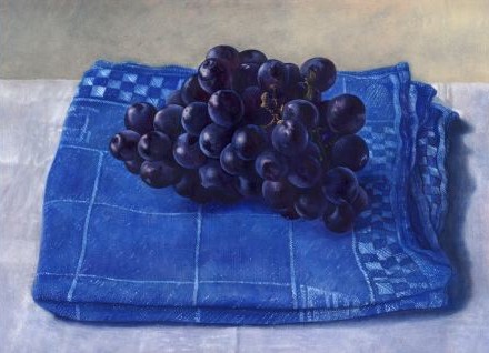
January 17th, 2007Many people think of underpainting as a working in monochrome — either in grays, or browns. Artists of the past like Jan van Eyck used very colorful underpaintings. The usefulness of this I see in my painting of grapes.
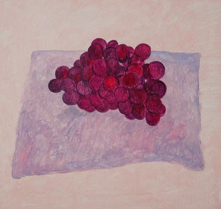
I was painting these grapes from some dark purple-blue grapes in my studio. I made the underpainting much more bright, and warm, than real grapes, as you can see in the picture above.
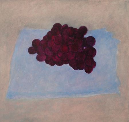
When the first layer of oil paint was dry, I began overpainting, putting darker shadows over the grapes to make the colors more realistic, darker and cooler, as you can see above.
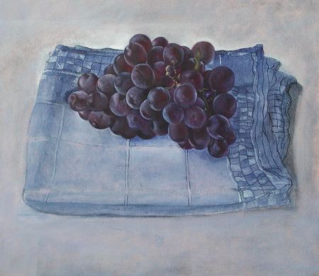
Here I have gone further with overpainting in another session. Now the grapes have a realistic color, but the brightness of the underpainting color shows through and gives life to the colors. If I had started with dark gray grapes, instead of a colorful underpainting, the colors would be dead when I did the overpainting. This this picture is not quite finished in the cloth. Here is where I left it yesterday afternoon.
Any suggestions?
(detail requested by Steve)
. . .
UPDATE
I’ve gone further with this painting. I’ve been thinking a lot about your suggestions from last time while I was painting. What do I need to do to finish the picture? Any suggestions? For reference, the cloth is about 25 cm wide at its widest point. Here are some details of the picture:
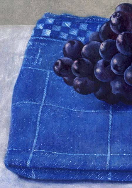
Let’s get closer . . .
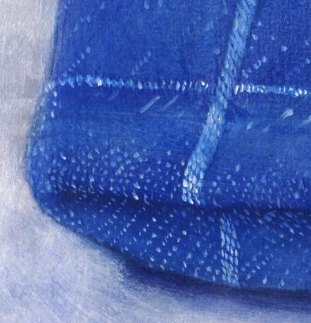
a bit closer . . .

and closer still. . .
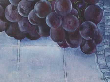
In this last image you can see some of the color from the first underpainting showing through.
January 17th, 2007 at 11:40 am
Every time I think you’ve really gotten so good you must be hitting a plateau, you get better, Hanneke. This painting is exquisite. Getting into the close ups was a good idea. Not many paintings can handle that kind of inspection. The fact that yours can is part of their lasting value, I think. It would take a person a long time to fully take them in.
But I think it’s time you talked about your tools and your mediums.
What kind of panels? How do you prepare your grounds? Which brushes (brand names, sizes)? What mediums? Linseed oil? Stand oil? Alkyd? A mix? How do you mix your glazes? Which colors? I can see you use good paint. You don’t get those strong colors on thinly applied applications without good paint.
Please?
It’s time to get specific. You have some things to teach, and details are important. I realize it’s a bit of work to describe all those things, but the benefits to our users would be great.
January 17th, 2007 at 12:32 pm
Hanneke,
Your work has a glow that I find irresistible.
Thank you for the close-ups. They might help me become a better painter. Then again, perhaps I aspire too high….
January 17th, 2007 at 12:34 pm
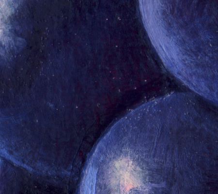
As Rex says, the skill and attention of the painting down to the finest level of detail is amazing. I love spending lots of time looking at the textures. However, there is one aspect that I think was better in the earlier version, and that is the surface appearance of the grapes. The latest version has rather sharp and contrasty specular highlights, which to me are making the grapes look a bit like plastic fruit. David may know a lot more about how surface reflectance is related to material properties from his computer graphics work. I could point you to some reading, but the technical stuff would probably be interesting for you only as guidelines to certain aspects of rendering to pay attention to, and I’m hoping David has an artist’s perspective on that.
January 17th, 2007 at 12:45 pm
Hanneke,
Indeed the grapes glow! Another beautiful painting! I too would love to hear about your technique. Is is made of thin layers? – it is hard to tell on the computer. And some of it almost looks like oil pastel (even though I know it’s not)because of the tiny brushstrokes – you do a lot of drawing with the paint.
I think some of what Steve is missing from the grapes is the underpainting showing through. I miss a little of that too, partly because this stage of the painting is so cool in color, with little warmth to counterbalance, besides that nice touch of fleshy pink in the upper right background.
I would expect to find touches of warmth in the foreground portion of the cloth (a slightly wamer blue in front) or perhaps even in the shadow area. The cloth reads so much as one blue, that it flattens the space slightly – it doesn’t shift at all incolor as it goes back in space (it certainly has the illusion of receding in its drawing – I am just talking color here). I never feel sure about commenting on color on the internet because monitors vary so much, so please disregard the comment if it doesn’t make sense!
January 17th, 2007 at 1:45 pm
Leslie,
Your suggestions about using color to indicate depth are right on target I think. This is something that Walter Bartman taught us in high school. I think this is one of the most important (and easy to overlook aspects) of painting.
Steve,
The earlier images were made with a digital camera by natural light. The images in this post are with a scanner, I think with an automatic tone adjustment. I will scan the pictures again and put a link for them. The colors are not quite as hard as they appear here.
Rex and Leslie,
It would be a great idea to discuss how Hanneke paints something like this in detail. Materials have something to do with it of course, but it is more a matter of the process. Hanneke has gotten several email requests for teaching. I wonder if this is something that could be done online with blogging.
One thing I noticed right away about this painting is the way that the grapes on the left are quite high above the cloth, not resting on it. Is this illusion convincing? How could it be improved?
Steve,
When I first started using the category “from life” (which Hanneke uses for this post, in addition to “still life”) I intended it to mean “from life, as opposed to from a photo.” Your post yesterday suggests that this category could be relabeled. Can you think of a better name for it, aside from “not from a photo”?
January 17th, 2007 at 2:04 pm
Karl,
Yes, I forgot to mention that the impression on surface reflectivity could be affected by image processing. On the “above the cloth” effect, it appears convincing to me. And as for the category, “from life” to me means “from the real/immediate world”, so needs no revision for dead subjects. ;)
January 17th, 2007 at 2:39 pm
Karl,
When you say, “Materials have something to do with it of course, but it is more a matter of the process…”
I get the feeling your just flippantly casting aside the question.
Sure, process is important (and thanks for explaining that like I was a little child), but what I don’t know and cannot see is specific information about the materials. I want to know what gesso is used in the ground, what grade of sandpaper, what brand(s) of paint, brushes and medium.
Know your audience, damn it. None of the painters here just rolled out of the back of the hay wagon when it comes to “process.”
P.S. I’m not as mad as I sound. I just realized you weren’t planning on answering the actual question and in fact dismissed it.
January 17th, 2007 at 3:17 pm
Rex,
Sorry, I didn’t mean to sound flip. I didn’t have time to answer earlier because I had to bring the kids to bed. I was in fact pondering how much work it would take to really try to describe how someone does this kind of work. You have to remember that even one’s own knowledge is not necessarily verbal. There is a process of doing, and also a process of figuring out how to explain it.
Hanneke went to bed early (long day) so I’ll try to answer your questions about the materials. Hanneke has been painting on masonite panels lately. I’d prefer her to paint on wood, but she finds the cost of good wood panels to make it difficult to express herself freely and take risks. She prepares the masonite with several layers of acrylic gesso. In the past she worked on quarter-sawn oak panels using rabbit-skin-glue/chalk “gesso” (the real stuff).
She uses sun-thickened linseed oil in the overpainting and glazing. Stand oil also works well, but it dries very slowly without a siccative. The colors, I’m not sure. Nothing exotic I think. She uses Old Holland tube colors which are the best that we know of that are mass produced. For other types of paintings we use handmade pigments and paints.
The basic painting technique could be described as an underpainting layer and an overpainting layer. Hanneke might use three or four layers in some places, but I don’t think a number beyond two is of fundamental importance. The key, especially in the overpainting, is to work “wet-in-wet.” You can think of this as very spontaneous painting done with fine brushes. That’s why the details are so nice to look at — they are really about action painting, not some kind of endless fussing with millions of layers. Look at the second detail, of the corner of the cloth. What you have here is a thin layer of blue paint (a blue with a bit of white mixed in to break the harshness) painted thinly over a form that has already been roughly depicted in the underpainting. With a thin layer of paint, where the paint is blended with a bit of thickened oil, it is possible to paint crisply in a way that is unlike what is possible with thick dabs of paint squeezed from the tube. Look at the spontaneous rhythm of white dots that she uses to describe the patterns in the cloth. A variation in pressure makes the dots stronger or weaker. She also varies the effect by using dots that are a mixture of blue and white. Before she put the dots on, she would have strengthened the shadows a bit with a transparent blue. Now I don’t know if she really got the whole effect in this corner with just two layers, but she could have.
The key to glazing is to realize that a true transparent glaze is seldom called for, except in accents, or in some special purposes. The concept of building oil paintings from many many transparent layers is not a good representation of traditional painting methods. Historically, glazes, when used, were used as a final layer, and then often painted into “wet-in-wet” with some opaque colors. The previous layers almost always contain some admixture with white or other opaque pigment. In Italian, the word used for glaze is “veil” (I understand), which is a much better word. There is a famous quote of Titiaan using 30 or 40 “glazes” or “veils” in a painting. If the quote is true, it certainly does not mean 30 or 40 layers in one spot. The most I have ever seen in a magnified section of a painting is about five or six.
As you probably know, if you try to make a painting technique based on pure transparent oil colors, you get a harsh glassy effect that is somehow unpleasant, visually and emotionally. This shows the power of glazing, but it must be used in moderation to get the right balance.
The brushes she uses are fine red sable watercolor brushes.
She doesn’t paint with any other medium than the thickened oil. She does not dip the brushes in this oil, but blends a bit of it with the paint to change it’s consistency, using a palette knife. Then she paints with this mixture. Too much oil and it doesn’t paint nicely — beyond the fact that it would wrinkle when drying. At the end of the day she uses turpentine and then soap and warm water to clean her brushes at the end of the day.
That’s the best I can do now Rex. I’ll discuss this with Hanneke in more detail tomorrow and report back.
January 17th, 2007 at 5:20 pm
That was a gorgeous answer, Karl — worthy of a post in itself.
I know it’s hard work to describe technique, but you certainly succeeded. Thanks for answering all my specific questions as well.
With someone as good as Hanneke, it’s a crime to not document her methods. You are definitely a one who would count as a primary source since you are so intimate with the artist and an artist yourself. Beautiful.
January 17th, 2007 at 6:51 pm
Masonite is formed from eminently stable components, as far as I know, and shouldn’t be any cause for concern. Rubens, who thought hard about his materials, basically had carpenters build a Baroque version of plywood for him. Panels over a foot wide were otherwise made of pure wood abutted side to side, and they consequently warped into a disappointing accordion pattern over time. In that regard, masonite is a safe bet.
When I taught traditional painting methods I asked my students to think of glazes as semi-opaque rather than semi-transparent. I myself previously had a wrong-headed idea about glazing, based incorrectly on watercolor and Titian’s dictum. You do, in fact, have to mix the paint and the medium with a knife and build form with it, as per Hanneke’s method.
As for what would finish it, I think it’s done. If anything, I’d look to see if the cast shadow under the grapes needs to be brought down closer to the value of the cast shadow of the towel on the table. In a perfect world there’d be another centimeter of white tablecloth at the right edge, but this is a panel, and it’s not worth worrying about. Exquisite work.
January 17th, 2007 at 11:00 pm
Hanneke, I fall more in love with your work every time I see it. YOu should consider making a video tape and selling it;) The process of Hanneke.. I bet it would do well. I certainly would buy it. This painting is beatiful…
Thank you Karl for explaing that.. It certainly helps those of us who wish to learn!!!
January 18th, 2007 at 12:20 am
Masonite is formed from eminently stable components, as far as I know, and shouldn’t be any cause for concern.
Franklin,
Masonite or related materials are used by many still life painters; I have seen paintings sold for many thousands of Euros painted on these types of artificial woods. At one time Masonite was regarded as a perfectly good art material; it has many practical advantages over wood. Unfortunately, it is not as stable as wood and is not well regarded by conservators. I think Hanneke’s work should be done on a better ground.
To mitigate the problems with Masonite, The Artist’s Handbook (5th edition) suggests a thick ground of acrylic gesso. To have such a ground even, it can be applied in many thin layers. In earlier editions, this book championed Masonite as an art material. The 5th edition reverses this position.
Regarding permanence, the key thing to remember is that the single largest danger to a painting’s survival is not the materials, but mediocrity. If artists paint great work with cheap materials, their work is more likely to survive than if they paint poorly with the best materials. Of course, great work with great materials can survive many centuries.
What would be an easy way to make a permenant panel for painting without using seasoned quarter-sawn wood panels? I’ve been thinking Hanneke could use use thick white matt board (acid free) of the type used in picture framing, pasted with starch past to a masonite or MDF panel. The matt board would be sized with a thin layer of acrylic gesso to prevent it from absorbing oil from the painting. If the Masonite became unstable after many years, the matt board could be removed and remounted. Anyone try this already? Any comments?
January 18th, 2007 at 2:18 am
What I’ve heard about Masonite is that — if kept dry — the stuff is a miracle of stability likely to outlast the life of the paint. So what’s the point in the mattboard? If it’s not absolutely perfectly sealed, the linseed oil will started rotting it within a few years. Dangerous practice!
The jury is still deliberating acrylic gesso though. It’s more flexible than oil, so violates the “lean to fat” rule. Some painters have gone with alkyd gesso for that reason. I’ve found that alkyd gesso tends to be overly slick and non-absorbent unless roughed up with sandpaper though.
I came across a huge discussion of this topic over at artrenewal. I’ll see if I can find it again.
January 18th, 2007 at 2:27 am
Here’s the article I remembered. Elliot is just repeating a lot of stuff you’ll find all over the place if you dig though.
January 18th, 2007 at 2:37 am
P.S. There are a number of brands of panel superior to the “Masonite” one. I’ve been using that word generically. Then there are the epoxy impregnated birch and spruce plys used in aircraft construction. Expensive, but really sweet materials.
Me, I’ll stick with the stuff they wrapped mummies in — linen. We KNOW that stuff lasts more than five thousand years.
January 18th, 2007 at 4:17 am
Rex,
I think that linen is the safest way to go as well, especially for larger works. One problem with modern materials, they have no historical “track record,” by definition. Of course, one must always be cautious about assuming that modern versions of old materials are in fact the same as the historical ones.
Painting on paper is much maligned. Old paper was made of linen fibers, and linen handmade paper is still available today. Painting on this paper with oils is perfectly acceptable for small scale work, if the paper is properly sized. If it is not properly sized, it will absorb the oil and become brittle — the same as a linen canvas would if improperly sized.
There is a lovely painting of St. Jerome and the lion, circa 1430, from Jan van Eyck’s workshop. I think it is in Antwerp or Bruge. I have also seen a small Dürer oil painting on paper from around 1500, perhaps in München.
January 22nd, 2007 at 4:15 pm
What do our A&P suggestions mean?
Let us think of Colin’s recent boat picture. Our comments (I am using my memory, not being on line right now): It was suggested that the little light triangle to the left of the boat should be eliminated as well as the very bottom, out-of-focus rear of the boat. I modified Colin’s picture doing that and the picture lost its magic. In my perception, the movement of the boat became ordinary and the black hill in the middle became unpleasantly accentuated.
Thus, my little exercise convinced me that, according to my taste, Colin’s picture was perfect and should not be modified.
Did our comments have an effect on how Hanneke modified her grape picture?
Looking at the full-size print-out of the 2007 picture (which looks just like what I saw yesterday on my lap top), the cloth looks darker, softer and more static. A print-out of the 2006 version shows a cloth of a luminous, ethereal color. The cloth shimmers. It makes me feel as if my eyes are bewitched and must dance across it.
Here are excerpt from the first five comments to the 2006 post that were made by different people:
1)… I admire the grapes but think that the cloth somehow hangs on the wall…
2) …I also see the friction between the grapes and the cloth…
3) …The grapes seem to be pasted onto the cloth in some places. Perhaps some color shifts would help them to talk to one another. The cloth does not quite look as if it were a surface…. I love the colors, the light…
4) …I am mesmerized by the grapes. There is delicacy of the ordinary piece of linen. I think you need a small plate or saucer sitting right in front of the grapes…
5) This is my comment: The grapes and the cloth are luminous… But, I could shoot myself for my next sentence: “Would it be possible to modify the blue cloth itself to affect a greater sense of stability?”
In my comment (#5), I was reacting to comments #1-4 above suggesting (a) an instability of the cloth and (b) putting another item into the picture. I thought that another item in the picture would destroy its simplicity. And I now think that the so-called ‘instability’ may have been the magic that made my eyes dance over the shimmering cloth.
Over the holidays, I was thinking of the cloth and eagerly anticipating seeing it again in 2007. But seeing how the cloth has changed, I wish I had said in 2006:
I love the coloring of the cloth.
I love its shimmering, its luminosity.
Please do not change it or my heart will be broken.
This is what has been going on in my mind over the last ten day since you showed us your modified picture.
Putting aside my dreams about your picture and, instead of looking at the new full-size version, I now focus on the close-ups, I can honestly say that the edge of the cloth looks lovely in its softness. But its changed loveliness does not reconcile me to my loss of what I had loved about it earlier. Can I buy a photograph of the shimmering cloth?
January 22nd, 2007 at 5:23 pm
Birgit!
Your passion for this picture is overwhelming, and you should be very grateful for your capacity to be so affected. Imagine how much lesser the experience of people that don’t care about art that way.
But I’m sure you’re underestimating Hanneke if you think she’d make a change just because we suggested it. She will consider our comments and agree or disagree with them. But she is much too strong an artist to do something she doesn’t feel is right for herself.