Cropping suggestions for Queen’s Day picture?
January 20th, 2007By Hanneke van Oosterhout
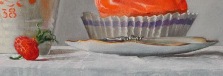
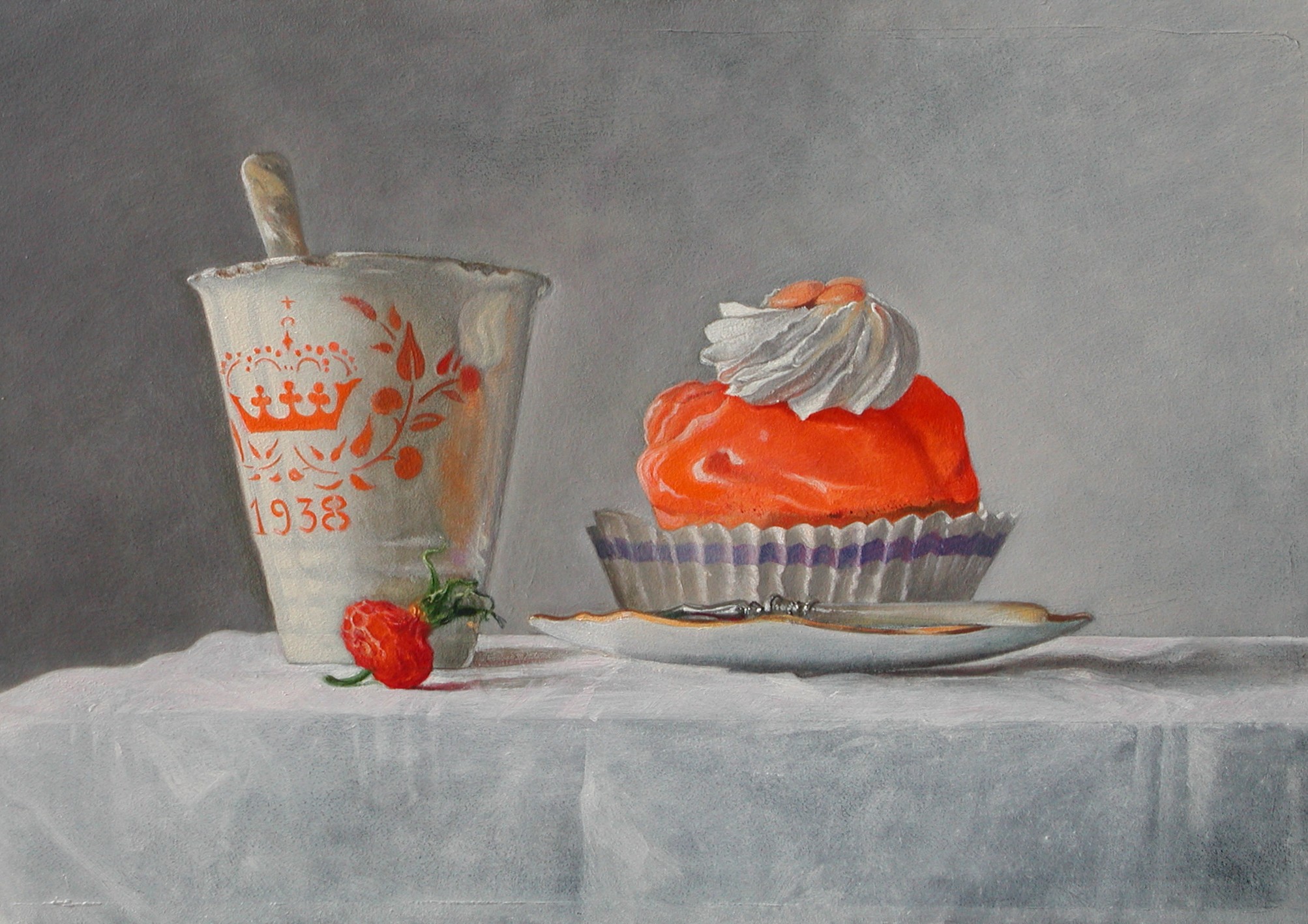
This is what I call my “Queens day” picture. It is of a very old cup that was given out when a Dutch princess was born, and of a pastry desert that you can only buy on the queen’s birthday. I wanted to do something with this very old cup and this thing you can eat on this special day because I found it such a challenging combination. Also, a painting in which the color orange is the head character is a challenge because it is not an easy color to paint with, and maybe not an easy color to look at. The House of Orange is the Dutch royal family.
This picture is not about primary colors, I think.
There are more interesting painting challenges in this picture. For example, mother of pearl in the handle of the spoon and fork. Here is a 640 KB version of the image if you would like to take a closer look.
What do you think about the composition? Could it be improved by cropping, or is it about right?

January 20th, 2007 at 2:38 pm
Hanneke’s paintings seem to usually be fairly static and centered compositions, which work well with her still life subjects and calm atmosphere. I couldn’t find any crop of this I liked better. One thing I think is interesting is that her other pictures with light backgrounds on her web site also have a lot of breathing room around the subject. The ones with very dark backgrounds are tighter; presumably too much black would become overwhelming.
January 20th, 2007 at 3:25 pm
Steve,
Hanneke and I seem to perceive this painting in different ways. For me, there is something not quite right, but I’m not sure exactly what it is. The color scheme makes me uncomfortable. There is somehow so much tension, which is intensified it seems by the apparent balance and calmness of the composition. I feel like there needs to be a change, perhaps adding color to the background — I just don’t know what. Hanneke feels that this discomfort is supposed to be there. I guess she has succeeded. This picture and the one of the moldy grapes are in some ways the most interesting of the still life paintings. I would like to see these two side by side one day.
January 20th, 2007 at 9:44 pm
This is to funny, paintings that seem to distrub others just seem to facinate me more. I like the brightness of this painting. It screams look at me and hey I think thats a good thing. I think you did well with the orange color as it’s different shades so it works for me. As always I enjoyed this one;)…I believe it looks good the way it is. The back ground works well with the images because it makes you focus on it. Thats one of the things I really enjoy in your work. Your attention is right were it’s supposed to be and not being distracted by other aspects of the painting…Thanks!!
January 21st, 2007 at 1:34 am
Hanneke,
The story behind the Queen’s Day picture is endearing, as are the colors. I like it that its orange that had to be used because it is a difficult color for the subject matter (old cup, lush dessert, tidbit of fruit) — and you’ve played with the variety within the orange and made it quite edible looking. The shading of the gray in the background works very well, both to offset the other elements in the photo and to add variety.
I don’t agree with Karl, either. Like wolfbaby, I find myself liking this picture as is. How big is it?
I should think it would be an easy one to sell, if that’s your intent — it isn’t maudlin or too sweet, about an event that could bring out those adjectives. And yet it gathers about itself a certain taint of nostalgia, in the best sense. The spoon certainly fits the rest.
I have a stupid question, brought about by the current season — is the queen’s birthday in the strawberry season? The strawberry is useful in balancing the image, but for some reason, it bugs me. Not the most elegant or technical words, but I can’t think of another.
Anyway, another smashing success, even with the strawberry, so far as I’m concerned.
January 21st, 2007 at 8:26 am
The fruit at the bottom of the cup is a dried out fruit of the rose which is orange of color when it is fresh and darker when it is dried out. I used some Alizarine Crimson. It just happened to be around in my studio where I keep all kinds of fruit dried out, rotten. Also the pastry is still there it is made from some kind of long lasting ingredients. But about the little fruit (how do you call these things in English anyway?) I also like the symbolic meaning: it holds the seeds for the future. This whole painting is probably hard to understand when you have never been at a real Queens Day in Holland, very emotional.
January 21st, 2007 at 9:37 am
Karl,
I notice that same unease you feel, but I hadn’t thought about it since you framed the post as a cropping question. The orange, so strong, is not just as accent but a large area of the subject, and there’s nothing to balance it. You had the idea of changing the background, but I didn’t see an easy, plausible way to do that. Just to see what might happen, I tried changing the foreground, i.e. the tablecloth, to a blue similar to the napkin in the purple grapes painting. The crude result is here.
I think that does have some calming and balancing effect, but I’m not at all sure I like the picture better. What do others think? Whether or not you like the change, does making a comparison this way help your appreciation of the painting, or is it pointless desecration?
January 21st, 2007 at 10:48 am
I would not change anything about the picture. It is so perfect in the clash of the shimmering whites and greys against the orange desert. The orange in the cup is calming.The blue in the dish is lovely
Having said that the picture is perfect, I also want to say that it makes me feel a little ill. When I was a small child, my father took me to a Kondittorei and bought me a very sweet cake with whipped cream which made me sick. I still don’t feel well if I eat too much sweet today (I don’t have diabetes). Looking at the picture, I would like one of those wonderful German pickles.
Thus, the picture is amazing. It so so perfect that it evokes strong likes and dislikes.
January 21st, 2007 at 10:57 am
Steve,
You are exactly right about the large orange thing. But whether it is a flaw or a key to the picture is a mystery.
When I saw your montage, I said, “Wow!”
I don’t know what I think of it, in terms of the painting and it’s message. As a sudden new vision of the painting, it knocks my socks off. I’m speechless (in a good way!)
January 21st, 2007 at 12:23 pm
Steve,
I realize that from a technical standpoint, the photo manipulation is simple. I am not astonished by the technology so much as by the visual result itself. I think you made an attractive choice of colors. Again, I’m not sure that is the goal, but it is pleasing to see.
Interesting to see how the white cloth was receptive to this sort of “digital” glazing. I imagine you could make any cloth like a white cloth first.
Hanneke has been looking at the image and she finds it beautiful. Too hectic here for her to focus on writing at this moment . . .
January 21st, 2007 at 1:06 pm
Woah Steve, These color manipulations are so interesting to look at! I love this painting, in its original state and with a blue cloth. Of course I am a sucker for a good cake painting! Very lush and delicious!
what is the size? Size matters, you know… :)
January 21st, 2007 at 1:20 pm
Also magenta, right?
January 21st, 2007 at 2:06 pm
The contrast between the blue cloth and the white conveys two different “feelings” to me. The white makes the image seem cooler, more dispassionate, slightly more distanced from the subject matter. The blue invites us to fall in love with the materials. Does anyone else see this change?
From Hanneke’s remarks, I suspect she might want the more involved feeling.
And Hanneke, I liked your comment about the fruit and its quiet resonance — “seeds for the future.” You said it perfectly.