A question of viewpoint
December 30th, 2006Hanneke can’t post today and she asked me to fill in for her. I wanted to remark on an interesting trend in some of the comments about her work. For example, looking at an image of Old grapes, new painting, Colin Jago wrote “I seem to be looking down on the grapes and up at the glass.”
For Colorful Underpainting, Steve wrote “my first impression was that the cloth was somehow mounted on a wall. The bunch of grapes and the way they rest on it make this interpretation virtually impossible, of course, but I still don’t feel the correct perspective as strongly as I would like to.”
Hanneke paints her still life paintings “from life” and she tries to paint what she sees. Is she trying to show multiple viewpoints, or to produce distortion in perspective? Not intentionally, she has said. But is she doing so unintentionally?
Let’s take a look at Hanneke’s imaginary still life drawing and see if can find out more about the viewpoint issue.
In this imaginary still-life, the vessel is seen directly from the side, but the table top and fruit are seen from a different perspective, from above. We seem to look down on the table top while looking at the vessel from the side. This merging of different perspective points lends an interesting quality to the imaginary drawings. More examples of her “multiple viewpoint” imaginary drawings are here, here and here.
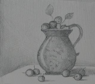
Let’s compare this to a drawing made directly from a real still life the same week when she made the imaginary drawings:

Do you see the difference? In this drawing from a real still-life, multiple viewpoints are not manifest. The fruit and the vessel are both seen from the same viewpoint.
I think that Colin and Steve are on to something with their comments about Hanneke’s painted still life work. In the “from life” still life paintings, the perspective may be technically correct, but she sometimes manages to produce a feeling of different viewpoints nonetheless. Would it be interesting if she tried to bring this difference in viewpoints more explicitly into her “from life” still life paintings? Or, should she work to correct the apparent flaw when it occurs?
December 30th, 2006 at 9:01 am
I’m not seeing much of a difference in the two pictures shown. It’s hard to accurately deduce viewpoint from just a piece of fruit, but we expect to be able to rely on the planes of the table and top and bottom of the pitchers being horizontal. In both drawings we’re clearly looking down at an angle to the table, but both top and bottom of both pitchers appear straight rather than elliptical, i.e. as if our gaze were horizontal. These are inconsistent with a single viewpoint. In the linked images, only the last has this issue; the first two show elliptical shapes for the tops and bottoms of the cylinder-like objects.
Multiple viewpoints may or may not be desirable. Personally, I think that a single, consistent viewpoint fits better with the otherwise realistic style. But as Birgit once said, it all depends on the artist. So I’m interested in Hanneke’s thoughts. Did the drawings seem at all inconsistent when she drew them; did she even think consciously about the viewpoint question? And looking back now, does she feel there is anything wrong or that should be changed?
December 30th, 2006 at 9:36 am
Steve,
please look at the perspective of Hanneke’s enamel cup http://hannekevanoosterhout.nl/2006/12/enamel-cup.html
Troels, a geometer, likes it the best of Hanneke’s picture. He just bought it.
Do you think that the perspective is correct? If not, does the subtle wrong in perspective give the picture an intriguing aspect?
December 30th, 2006 at 10:12 am
There is this famous old woodcut, German I believe, that shows this fellow looking at a reclining model through a gridscreen, but most relevant the questions posed here, he keeps his eye in the EXACT same position by resting his (nose?) on this little pedestal.
When drawing near objects, any slightest shift in eye position will give a different perspective. Many artists use little tricks to prevent this, like making sure one particular object is lined up vertically and horizontally with an object behind it, making marks on the floor for one’s chair, holding out one’s arm and touching the fingers in a certain place. Any photographer will be familiar with parallax error — the difference between eye position and lens position — always a problem with close ups and rangefinder cameras.
I think that if Hanneke wants to go that way, then she needs to exaggerate the effect, but cubism is a dead horse. The novelty of such effects wear off quickly while the constancy of Hanneke’s tradition forms a strong base for the uniqueness of her individual expression, and so her work has lasting power. So in my opinion, she should just pay a little more attention to her eye position, using the aids and devices she discovers. In particular, it is the ellipses at the tops and bottoms of the cups and vases that really show up as different when there is only the tiniest difference.
Birgit,
I saw this piece on Hanneke’s site yesterday. It is just right. There is a certain quality of “hand madeness” which contrasts perfectly with what was a manufactured item. So the object is humanized. I just love the whole silvery look too.
December 30th, 2006 at 10:15 am
Thanks, Rex, I did not want to ask Troels my question posted above because I want him to enjoy the picture without having to verbalize why he likes it.
December 30th, 2006 at 10:22 am
Birgit,
I guess Troels must enjoy the winter there; he has chosen the only painting with no warmer colors in it! By the way, Karl should update the web page, the cup is still listed for sale.
I think the picture looks great, and I don’t believe I would have thought about perspective if you hadn’t asked me. But since you did, and I checked it, I do find perhaps a slight deviation from a single viewpoint image, depending on how far away you sense that the viewer is from the cup. The ellipses of the cup and saucer rims have almost exactly the same shape (major:minor axis ratio), although in principle the saucer rim should be a bit closer to a circle, since we are viewing it from an angle closer to (but still far from) head-on. The effect for me is that the cup looks slightly more open than I would expect. I emphasize that this detail doesn’t bother me at all, especially as the saucer in particular is somewhat distorted, presumably due to some interesting history.
December 30th, 2006 at 10:24 am
I agree with Rex’s comment, which crossed with mine.
December 30th, 2006 at 10:28 am
Thanks, Steve,
glacial beauty?
Another reason that Troels prefers the Enamel Cup may be that he is somewhat of a ‘minimalist’.
When I did my wall hanging, he stopped me from putting in the children. He thought that it would start looking too busy.
As an aside, your question ‘why does the sun have two colors’, reminded me of an Isaac Asimov short story about the stars that begin to change color as they dim. Perhaps, the two color scheme signifies that I do not have my entire life ahead of me?
January 3rd, 2007 at 12:51 am
I just lost my post and may try to reconstruct it. Or maybe I’ll just go to bed and gain a new perspective in the morning.