Critique Me!
November 11th, 2006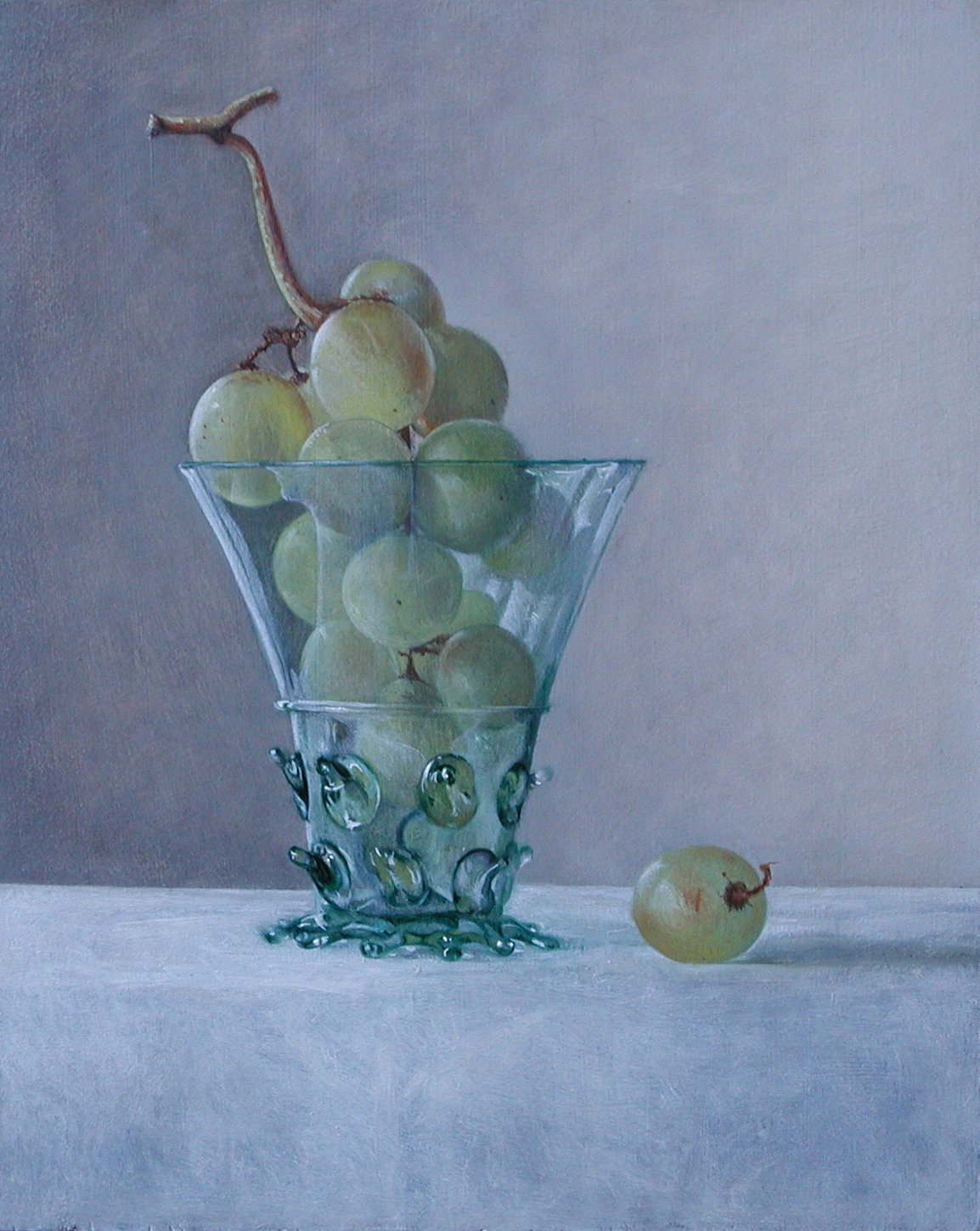
Hanneke van Oosterhout recently showed this painting in earlier states. She got valuable suggestions from Rex, David, Colin, Jon, and Jewel as to how to improve the picture. Rather than respond in words, she has responded by modifying the painting itself. The latest version is shown above [click image to enlarge].
Is the painting finished?
. . .
November 11th, 2006 at 7:22 am
Wow. You really fixed the things that were mentioned. The grape to the right looks succulant enough to eat. The glass looks cold to the touch, sharp, clear… And you fixed the shape!
And now the cloth on the table is so luminescent, so soft.
Ah. Splendid. My eyes are watering. You think I’m kidding? I’m not.
This painting is finished.
Thank you for the opportunity to participate. I feel a certain sense of ownership. Is that a kick or what?
I don’t see that cool signature of yours yet though.
November 11th, 2006 at 7:48 am
hi Rex,
I didn’t sign it because it is not finished yet
but now I am afraid to spoil it!
Thanks for your participation!
Hanneke
November 11th, 2006 at 8:27 am
Ah, that’s lovely! It’s still a bit dark, but the soft, smooth atmosphere welcomes the darkness. I love it. Fixing the cloth beneath the glass of grapes has helped a bundle. It keeps the eyes focused on the fruit instead of things that are less important.
The painting in general feels much more cool and soft, while before the colors were much warmer. The coolness really adds to the feeling of the soft, smooth atmosphere. Wonderful!
I’m sure there are still things you could fix up to make the piece even better, but for me, I think it’s perfect just the way it is. Nice job.
November 11th, 2006 at 9:12 am
Hanneke, the edge of the table is less differentiated in the new version. Looking at the photo of the new picture, I feel a little like a child, looking up at an object high on a table. The photo of the earlier, brown picture, with its stronger edge, gave me the feeling that the glass was more within my reach. Perhaps, scanning the picture led to a lack in detail that promotes the illusion that the new glass stands higher up on the table.
November 11th, 2006 at 9:46 am
Fixed. Lovely. Finished.
November 11th, 2006 at 10:37 am
This piece has a very reflective “north light” feel, it is very cool, well rendered, a nice subject, etc. I do wonder how it would look with a warm light hitting somewhere on the stem or top of the grapes, this would be enhanced by the majority of cool light. The effect would be dynamic and austere. I say this because when viewing your work as an artist, this is the thought that jumps to my mind; this would also obliterate any comments about the work being “cold”. Your work has a “monumental” feel, attracting one’s attention to gaze.
November 11th, 2006 at 11:48 am
Congratulations! It looks great! If you don’t want to sign it on the front, you can always sign it on the back, or verso as they say. It’s perfectly acceptable to do either. Beautiful work.
November 11th, 2006 at 11:51 am
Congratulations! It looks great! If you don’t want to sign it on the front, you can always sign it on the verso, which is a fancy word for back. It’s completely acceptable to do either. Beautiful work.
November 11th, 2006 at 12:11 pm
Great work! You did it!
PS – You can always sign it on the back if you want. Either way is totally acceptable.
November 11th, 2006 at 11:20 pm
First of all, this is really lovely. The light on the glass and the grapes is amazing. Having looked at the first critique, I agree that the fold in the cloth was distracting, but now it’s not clear what’s happening with the table in the foreground. Are we seeing the table edge? or an expanse of table cloth? The painting seems ambiguous here.
November 12th, 2006 at 10:34 pm
I do not know all of the technical terms and stuff for art but I know what I like and I love the colors in this. The detail is awesome!!! I love how you did the light on the glass and the table cloth!!! I feel like I could step into this picture…