A painting a [in several] day[s]
November 6th, 2006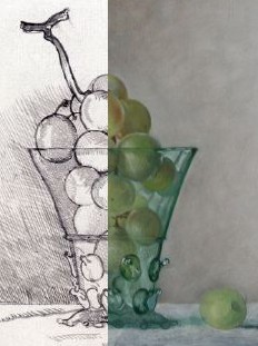
by Hanneke van Oosterhout
Recently we looked at one of Hanneke van Oosterhout‘s finished still life paintings. There were a number of excellent critiques. The painting was already sold, however, so comments could have no further impact on that picture.
Now Hanneke is in the progress of making another still life. It is not yet finished, which means that your comments could help her make this painting better.
We can follow the painting’s development over several days.
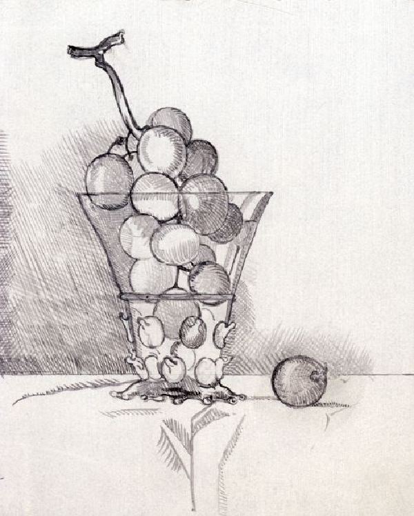
Here is an underdrawing made directly on the panel with black acrylic and a fine brush. The underdrawing took less than an hour. This underdrawing was transferred from a pencil drawing on paper made the previous day (click images to enlarge; work on paper not shown).
The next day Hanneke did the underpainting in acrylic, painting over the underdrawing thinly so that the hatching shading of the underdrawing is almost hidden, but still has an optical effect. The work in acrylic took less than an hour.
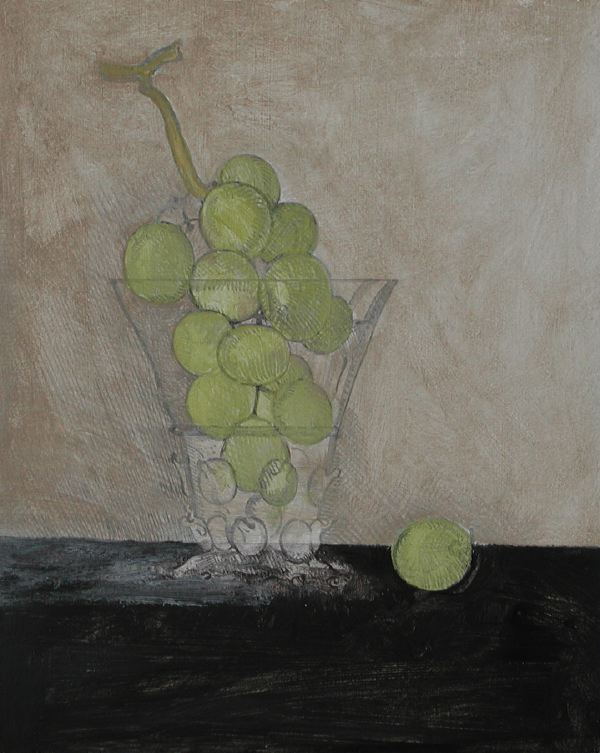
Next she did a first pass at overpainting with oil, begun immediately after the work in acrylic was dry. Hanneke painted very thinly, starting with the dark tone in the background. Then she added lighter color on the right side. Then she started to paint the grapes because she understood the the grapes would not last long (but would dry out in a few days). “I gave all the grapes shading, then started to paint lighter parts. Started with left top grape, that part is done the best,” she says. She used oil paint from a tube (Old Holland) and thinned it with a bit of linseed oil. No turpentine was used.
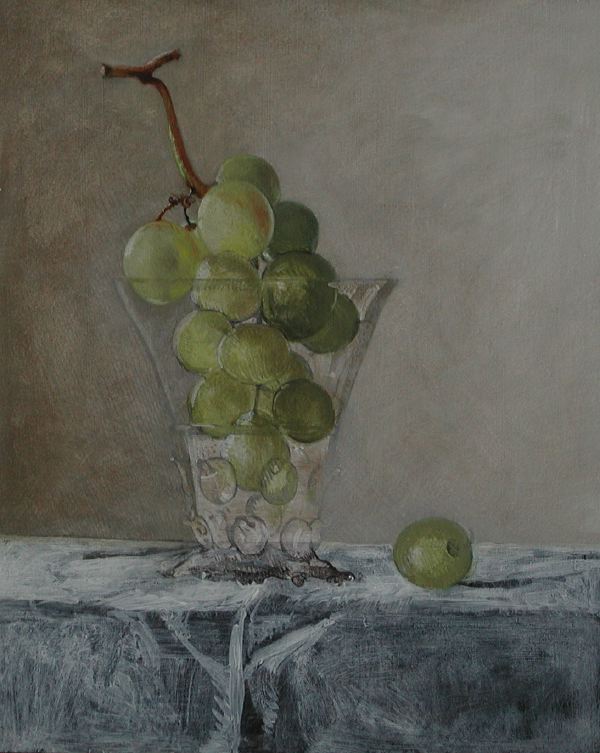
Below is the results from another day where she overpaints with oils (the previous layer had already dried).
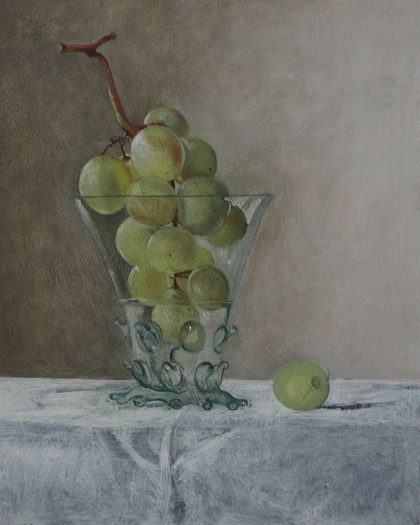
Below, two images from yet another day working with oil paint, where she develops the glass. First she applies a transparent “glaze” . . .
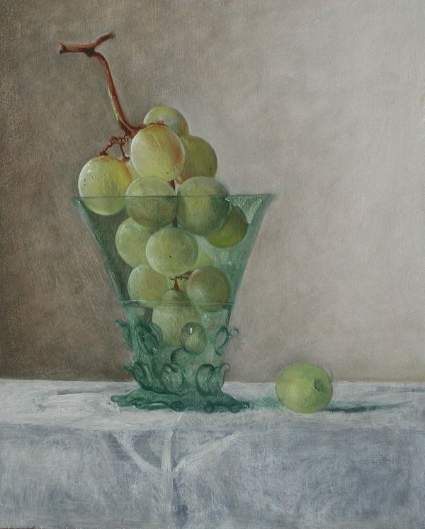
Then she works wet-in-wet in the glaze, adding highlights and deeper shadows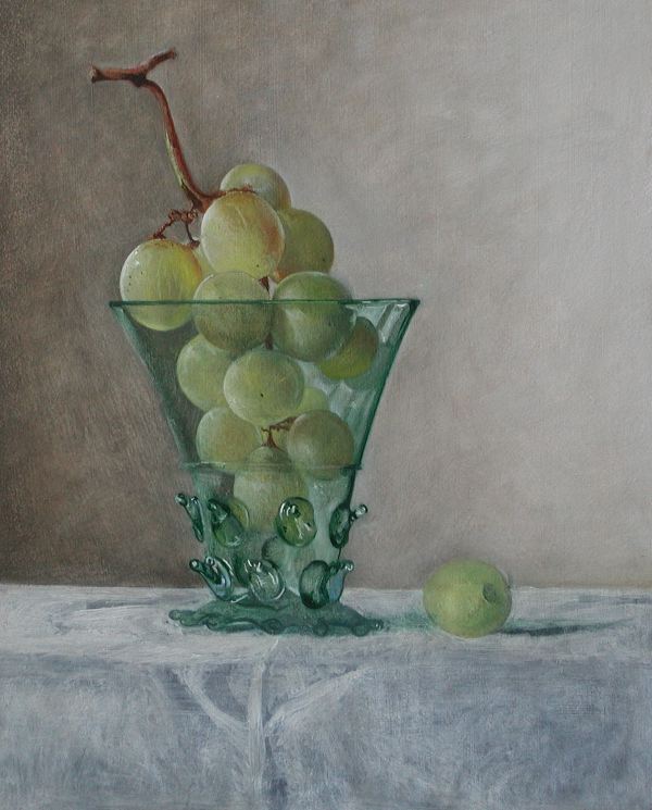
This painting is pretty good now, but it needs something. Any suggestions?
[Below is the final version of the painting, now sold]

Glass with grapes by Hanneke van Oosterhout
November 6th, 2006 at 3:41 am
A Flash animation of these images would be nice. Can someone recommend the easiest way to do this?
November 6th, 2006 at 4:22 am
First, it should be established by now that I’m a fan of Hanneke. Her ability to render texture, whether glass, cloth, fruit… anything, is just as good as it gets. Second to none. This is her great strength. I adore this skill, and this picture has it.
That said, the first big impression is that this picture needs more contrast. I realize she’s going for an ambient, light effect, so bumping up the contrast is a dangerous and delicate task. How to do it without losing the ambiance (all around light)? My suggestion is simply 1. Strengthen the drawing but applying precise but very tiny touches of very dark color in strategic locations, a glaze (glossy transparent color) is indicated. 2. Only then apply the specular highlights. I know Hanneke knows what I’m talking about.
This picture would really pop then.
However, from the very beginning the shape of the glass was slightly skewed to the left. If that was intentional, then perhaps exaggerate that because it does not look intentional; it looks accidental. Unfortunately, doing that would involve not a little re-painting of parts that are already beautifully rendered. I wish I had seen this at the drawing stage. I would have asked about that then when it was easy to fix. One thing about glass. It gives optical illusions when you look at it. Sometimes you have to draw it wrong in order for it to look right. Sometimes you have to use some drafting aids to get shapes squared up, parallel, or symmetrical. It is not cheating to use a T-square or grid lines here and there. Ask Durer, Leonardo, Vermeer, or Van Eyck. If your going for symetry, then a ruler is a handy device at the early stage.
Thanks for putting this image series up. A real pleasure to see.
Cheers
November 6th, 2006 at 9:54 am
Yes, I agree, it’s very interesting to see this painting-in-a-making group of pictures. I love to see how differently artists go about creating their work. Wonderful.
The glass is very lovely, and the color of the grapes is so nice. The only thing I can see that turns me away from this painting is how dark it is. Perhaps this is what the artist was going for, or perhaps it’s the fault of the scanner. Also, the cloth seems to be a touch flat. The wrinkle right in front of the glass of grapes doesn’t seem quite right. Again, maybe it’s intentional.
At any rate, there is my opinion. I still think it’s very lovely.
November 6th, 2006 at 11:47 am
Beautiful painting. Here are 3 suggestions:
1.) I agree w/ Rex that it needs some darks and brights. There doesn’t need to be alot of this, just a few darker accents, perhaps where the glass contacts the table, one on the rim of the glass, and one up on the stem near the top. Same thing w/ specular highlights – one or two hits on the glass and again on some of the grapes.
2.) There are a few issues about the grape that’s on the table. For one thing, look at the way the shadow on the wall behind it follows the shape of the grape. It seems attached to it, as does the little ripple in the fabric at the right side of that grape, at the back edge of the table. You might want to clean up that back edge so it passes behind the grape, and make the shading on the back wall seem to go continuously past the grape, not around it. There also appears to be an outline that goes around the left side of the grape down to the front. The outline of the right side works to create depth, but the one around the left flattens the image. I’d look more carefully at how you can use color/tonal differences to define that edge. A little more light on the upper part of the grape, and possibly a specular highlight, would give this grape more volume, and more visual weight in the image.
3.) Regarding the cloth, my eye goes right to the birdclaw-shaped fold directly below the glass, which almost (visually) becomes a pedestal for it. It might be good to get rid of that fold entirely, or move it off-center and change the shape of it. Also there’s a spacial discrepancy between the cloth on the left and right sides of the fold. On the left, it appears that we’re seeing the top and front surface of a table, whereas on the right it appears that the tabletop comes all the way to the front edge of the picture. I’m not sure which is going on, but it might be good to look more carefully at the light and shadow that define those planes and make the space read more consistently.
Hope these notes help. It’s a very beautiful painting. Just needs finishing.
November 6th, 2006 at 12:00 pm
“the first big impression is that this picture needs more contrast.”
Rex, good point. Hanneke is using a light background here, which has less drama built in than the black background we saw last time with the strawberries. Such a picture needs to have the drama, the contrast, built up in strategic ways. You explain how.
“from the very beginning the shape of the glass was slightly skewed to the left”
Ugh, you’re right! What to do, what to do? In the underdrawing, the effect is especially strong in a mirror view.
However, in the last state of the picture shown, the asymmetry is less annoying, even though geometrically the same (I assume). The reason is because she has emphasized one side of the glass and left the edge on the other less salient. Thus, painting has partially corrected the flaw. [What flaw? That was obviously intentional, in a subconscious way. Right Hanneke?]
Jewel, I think the painting looks a bit dark because, although it has a light background, it is seen here against a pure white screen. With the correct frame, the picture would seem more luminous, I think.
I agree about the cloth, Jewel. The wrinkles are not very satisfying. Hanneke started out with a drawing of the cloth, nothing spectacular, but a plan. Then she painted it mostly black, and started it again. I would not have done it this way. It makes the cloth inconsistent with the rest of the picture, for no good reason (in my opinion, obviously). It forces Hanneke to build up the cloth essentially from nothing, while the rest of the picture is more developed.
For my part, I’m not yet satisfied with the way the glass sits on the cloth — obviously not finished yet. The grape on the table is also not finished. I think there needs to be more of a statement with the cloth in the sense of a variation from left to right, top to bottom, or somewhere.
I think the background is good on the left side, it seems like air. Towards the right, the background begins to become solid, almost like stone closer to us than the glass.
I’m glad I don’t have to finish this picture myself. I think the most difficult work is ahead!
November 6th, 2006 at 12:26 pm
Hanneke and I are running around trying to keep a three-year-old and a four-year-old under control, and make dinner at the same time as reading the comments above. Hanneke’s two initial comments are:
1) I want to run to the studio and start painting this very moment,
2) Karl, print out those comments on paper!
November 6th, 2006 at 12:35 pm
Hanneke’s work is impressive, she has fine rendering skills. There seems to be a sense of reverence for her subjects, and feeling of classicism: as though they were objects from an ancient time.
Contrast has been mentioned, as well as darkness. It may be from the “white background”, or it may be because there is no “black” in the piece, and very little “white”. Also, I see talented painters that paint exactly what they see… even if they started in bad light. One might even tell what kind of lightbulb painters are using when they paint in some works. But controlling the light is a big “do”. Basically, I like it as it is, shaded in low light, to keep the fruit fresh.
November 6th, 2006 at 2:13 pm
Jon,
That’s a nice way to look at it, subtle shading to keep the fruit fresh. Harsh lighting and contrast would give a different feeling.
November 6th, 2006 at 5:12 pm
There seems to be more light hitting the fruit at the top than the glass. I think that that, and the total transparency of the glass on the left, is what is responsible for the low contrast feel. The top grapes glow, but the glass doesn’t until the catchlights near the bottom.
I am unworried about the apparent distortion in the glass, but I am worried about the base of the glass which seems to be leaving the table on the left. Perhaps altering this would also change the apparent distortion further up.