Inspiration from Mr. Bartman, my art teacher in high school
October 29th, 2006Posted by Karl Zipser
I made this painting in the summer of 1985, when I was sixteen years old. I painted it over the course of several mornings, standing on a dock in Woods Hole, Cape Cod. This is one of my first landscape paintings in oil.
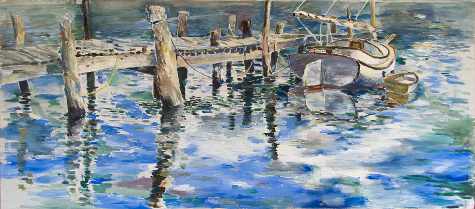
I was able to do work like the above because I was part of a group of motivated students in the art class of Walter Bartman, a high school teacher in Bethesda, Maryland. “Mr. Bartman” inspires his students to believe in art. The picture above I made during the summer vacation, outside of Bartman’s art class. And yet his spirit was there with me on the dock.
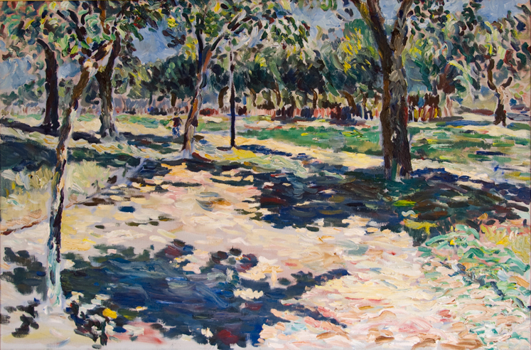
Later that summer I made this painting of the Mall in Washington D.C., in Bartman’s summer landscape class. I was most pleased with this picture at the time, and I still think it is pretty good.
Walter Bartman had many outstanding young students during his teaching career at Walt Whitman high school (in a suburb of Washington D.C.) before he retired in 2001. Here is an interview I did with Walter Bartman.
Did you have a teacher who gave you a special inspiration for art?
October 29th, 2006 at 3:22 pm
Lovely paintings. Your teacher reminds me of Ron Enlow, the English teacher I had the pleasue of studying with in both junior high and high school.
October 29th, 2006 at 3:35 pm
After our long discussion about praise and criticism in Jon’s post, it seems only fair that I practice what I preach and do some self-criticism.
I’ll take the second painting. I’ll skip any positive remarks. Here are the flaws:
1) The colors are not as robust as they could be. The picture gets its strength mostly from luminance contrasts. I’m painting here, why not make the most of colors? The only defense is that this is of a scene in bright sunlight, and in this condition, strong light/dark contrasts can dominate color contrasts. But I am not making that defense. If you look at the shadows in the lower left corner, I get a bit muddy and noncommittal about warm-cool contrasts — the same thing I complained about in Jon’s portrait earlier. David came to Jon’s defense there. Fine. But I’m not pleased with the muddiness here.
2) The use of spontaneous, visible brushstrokes gives an opportunity for creating texture which I don’t make the best possible use of. I think I could have made more variation in the size of brushstrokes to indicate depth.
3) I could use a stronger sense of aerial perspective, cooler colors in the distance.
4) I could use a stronger framing of the picture at the top by the branches of the trees. These might balance the two strong shadows beneath the trees better. As it is, the picture at the top fades into the white background. Of course, a good frame could solve this problem also. But, why not do it in the painting itself?
5) The vertical line between the trees, probably a lamp-post, is a bit too continuous and strong, especially for so irrelevant a detail.
6) The trees in the upper right are not developed as much as the rest of the painting.
These critical comments are just the sort of thing that we would give one another in Bartman’s class when we had group critiques. The group critiques helped us improve. We could have used even more of them. My self-criticism here doesn’t take away my appreciation of this picture. But it gives me things to think about for next time. It would have been really handy to have back in 1985.
October 29th, 2006 at 3:41 pm
Could you say a bit more about how Ron Enlow inspired you?
October 29th, 2006 at 10:53 pm
Karl, I stared at the “painting of the park” so long, I thought I saw people in it. I wouldn’t have thought you would paint in this style: I’m impressed you painted this well 20 years ago. Are youe still painting now?
As a painter, I see the composition as being pleasantly and believably complex, and quite good; you have plenty of nice verticle movements, the shadows give a nice horizontal motion, and the sunshine behind the vail of trees calls me forth to walk through.
Perhaps the contrast in the front could be aided by slightly more intense chroma (like a dab of pure blue and orange) to suggest the values moving away from them. The line (perhaps of the trail or road) on the left side, one third up, moving in and up, seems a little “hard” to me; the left side is perfect. The shadows look fine and do not need to be lighter the farther back they are; due to the thinning of their lines. Lastly, and something that irks me in my own attempts, is capturing foliage in a more believable texture. This painting is as good as any gallery painting by any top artist out there. Nice work, Karl!
October 29th, 2006 at 11:09 pm
Foliage texture. Jon, there is a great comment. I work a lot on this issue now, but I did not look critically at the older painting in this regard. When you mention it, I see the problem. Thanks.
October 29th, 2006 at 11:26 pm
Some comments I would like to make on your own comments. As an exercise to let you know what I see when you lead me through what you see, I will go number by number.
1. The colors do not have to be robust, this may be suggested by intense chroma in the foreground; the eye will naturally read it and believe it for the rest going back into the picture. The muddiness you see, is not what I see; I would have thought you were directing the looker by purposely muddying the color on one side to suggest the depth of field as we actually really see it to the more focused side.
2. Your right about varying the brushstrokes to achieve more depth; but also consider just building up the paint to achieve the same,(better),effect in the foreground.
3. ??? and I do not know about using the “cooler colors” in the distance. Why tamper with the success that is already here?
4. ..yeah ahuh. perhaps if we added 1/238th of one percent of dioxine purple to the……I’m joking Karl! Seriously, this one could lead to a “can of worms”.
5. Didn’t even notice. By the way, if you remove the pole, where will you lock-up your bike; see the problem with taking things out.
6. I think the foliage is the only thing that needs any attention on the trees, (because most folks recognize trees by the foliage shapes), the trunks are obscured nicely, (that is nice way to handle detail overkill). Seems to me the reason the trees are not as developed in the upper right, is because the is no more paper left to develope them on.
Looks like you had a fine teacher, (there are some good ones out there, that is for sure). If this is how your class operated, this piece of art shows the power those critiques had on you as a student, and the level of skill you were able to achieve in understanding how to produce work this fine in high school. Thanks for sharing them!
October 30th, 2006 at 1:49 am
Oh man, Karl, that first painting of yours brings back memories. I spent the summer of 1978 living in Falmouth, playing music in clubs and restaurants up and down the Cape. During the day I used to go to that little harbor in Woods Hole and paint watercolors of the boats. Then I’d head over to the Fishmonger’s Cafe.
I had a number of teachers that inspired me at various points. One was John Roy, who was my MFA adviser at UMass. He had been Josef Albers’ teaching assistant at Yale, and was a well-known color theorist in his own right. Most of the other students were afraid of him, but he and I really hit it off for some reason. In addition to the benefit I got from his tough thought-provoking critiques, I co-taught his color class with him for several semesters and learned a lot from him about teaching. He ended up being almost like an uncle to me. We had many great conversations that inspired me to look at the world from a different perspective.
Another teacher who had a huge influence on me was the painter Gregory Gillespie. He wasn’t actually on the faculty anywhere, but became more of a personal mentor. I had seen his work at the Hirshhorn in DC, and he was (and still is) one of my favorite artists. He was one of the main reasons I chose to go to grad school where I did, just because he lived in the area. I would go out to his studio a couple of times a semester, and he would show me a lot of technical things about how he painted. Other times we would talk about other things, life and art and philosophical stuff. Just being around him and seeing his paintings in progress was an enormous inspiration in itself, but he also gave me valuable feedback on my own work.
John’s approach to art was scientific and analytical, while Gregory’s was intuitive and psychological. Between the two of them I got a pretty diverse art education.
October 30th, 2006 at 3:30 pm
David,
For the Fishmonger’s Cafe: take the boat straight ahead across the Eel Pond, then turn right.